

Colour Psychology in Art, Décor & Feng Shui
Colour is one of the most powerful elements in both art and interior spaces. It influences how we feel, how we experience our surroundings, and even how we interact with a room. Artists have long understood the emotional impact of colour, using it to create mood, atmosphere, and meaning within their work.
In the home, colour also plays an important role in shaping the energy of a space. Interior design, art placement, and even traditional philosophies such as feng shui all recognise that colour can affect wellbeing and balance.
When used thoughtfully, colour becomes more than a visual choice, it becomes a subtle language that shapes the environment around us.
The Emotional Power of Colour in Art
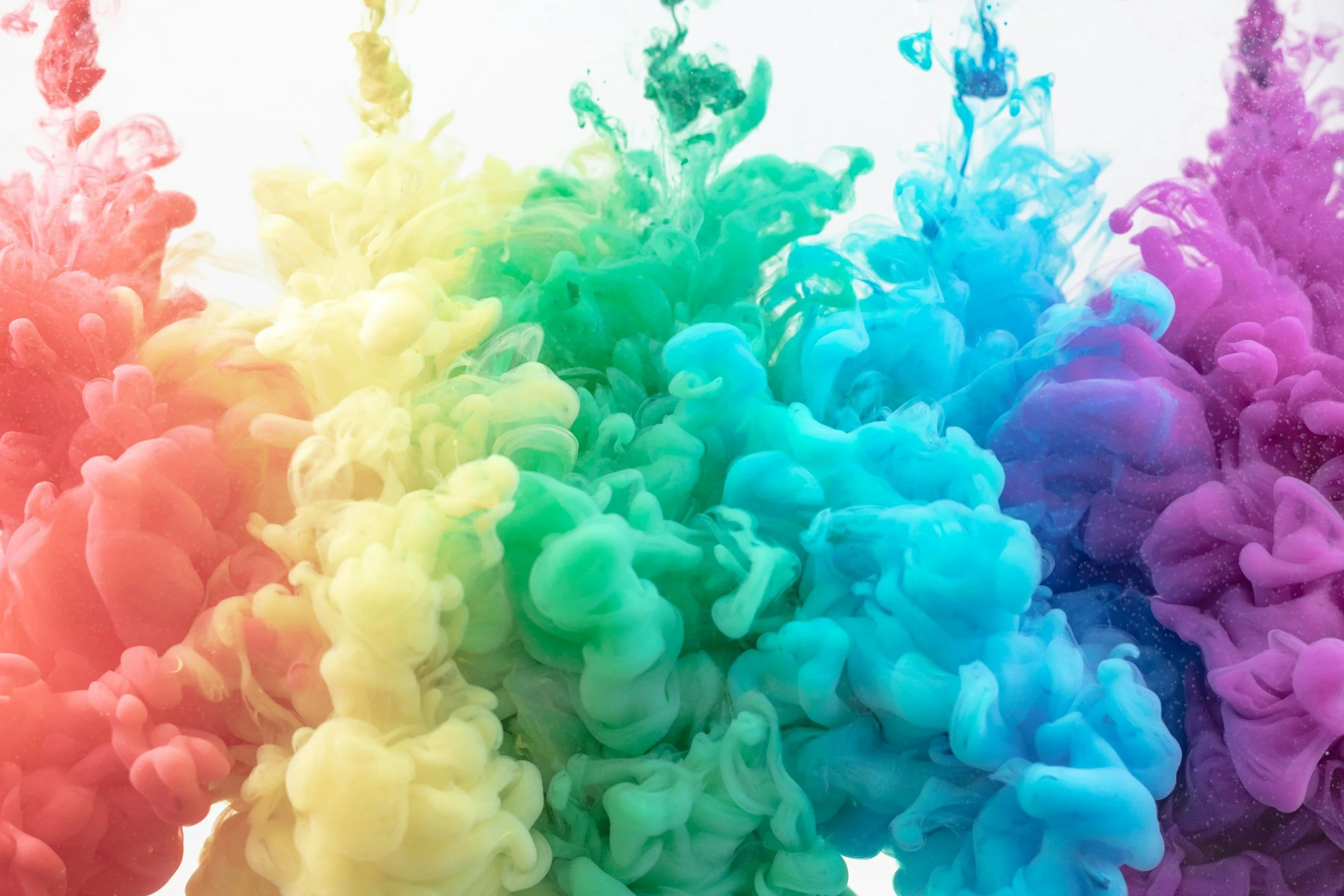
Artists often use colour intentionally to communicate feeling. Soft blues and greens may suggest calm and openness, while warmer tones such as reds and oranges can evoke warmth, energy, or passion.
Abstract artists frequently explore colour as a form of emotional expression. Instead of depicting a specific scene, the artwork allows colour itself to become the subject. The viewer responds instinctively, experiencing the mood through colour rather than through literal imagery.
Because colour has such a direct emotional effect, the artwork we choose for our homes can subtly influence the atmosphere of a room.
A calm painting in soft natural tones may encourage relaxation, while vibrant colours can energise a creative space.
Colour and Interior Atmosphere
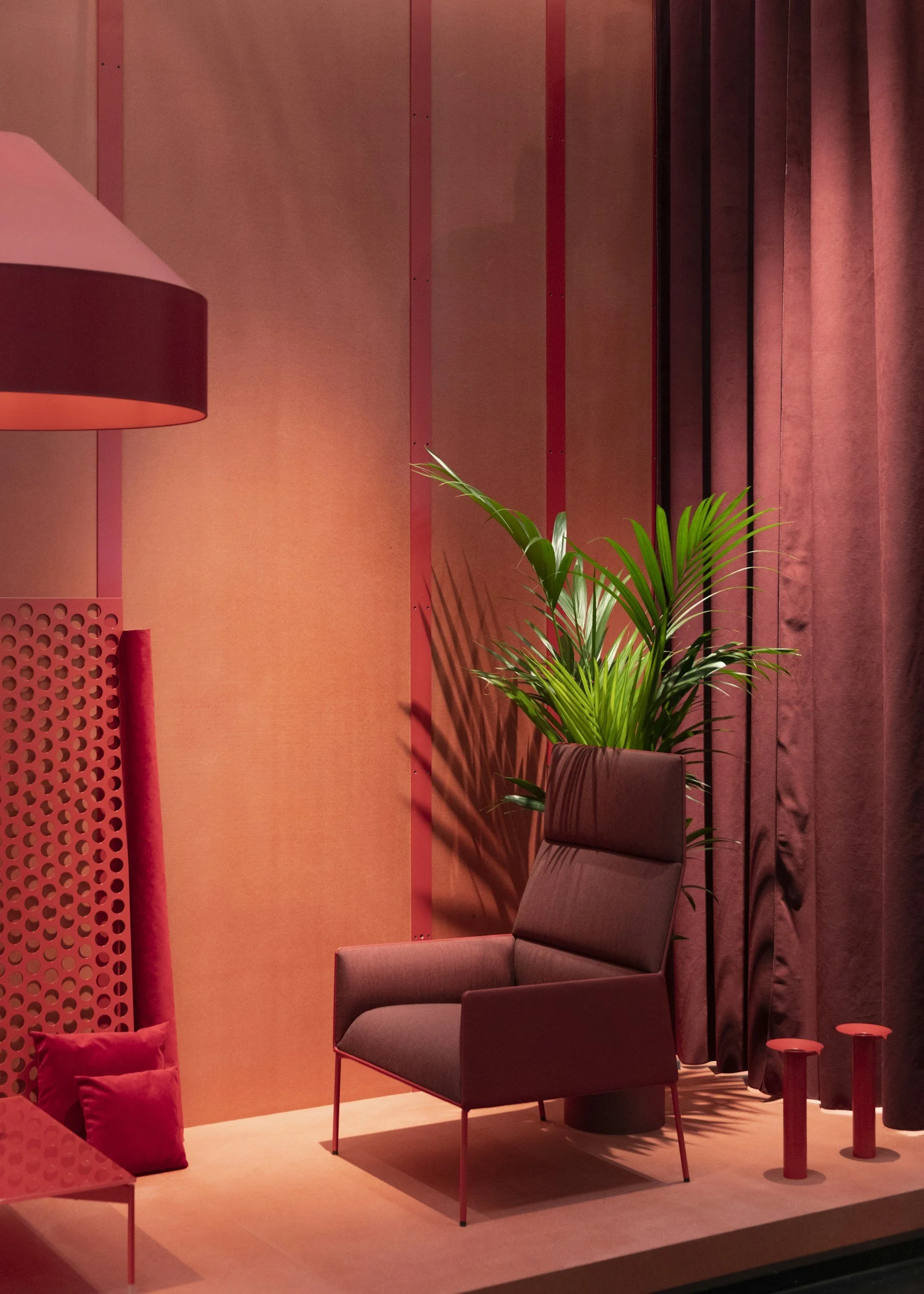
Interior designers often consider colour one of the most important elements of a room. Wall colours, furnishings, textiles, and artwork all interact to create the overall mood of the space.
Light colours tend to open a room and create a sense of calm and clarity. Natural shades such as soft greens, earthy browns, and muted blues often feel grounding because they reflect colours found in nature.
Deeper tones, when used thoughtfully, can create warmth and intimacy. Rich blues or deep greens may give a room a feeling of depth and quiet reflection.
Artwork can act as a bridge within this colour palette. A painting may introduce accent colours that tie together different elements of the room, helping the space feel cohesive and balanced.
Feng Shui and the Energy of Colour
Feng shui, the traditional Chinese philosophy of spatial harmony, also places importance on colour. In feng shui, colours are connected to the five natural elements: wood, fire, earth, metal, and water. Each element is associated with specific colours and qualities that influence the energy of a space.
Green and brown tones represent the wood element, symbolising growth, vitality, and renewal. These colours often work well in spaces where creativity or new ideas are encouraged.
Red, orange, and vibrant pinks represent the fire element, associated with passion, recognition, and dynamic energy. Used sparingly, these colours can add warmth and vibrancy to a room.
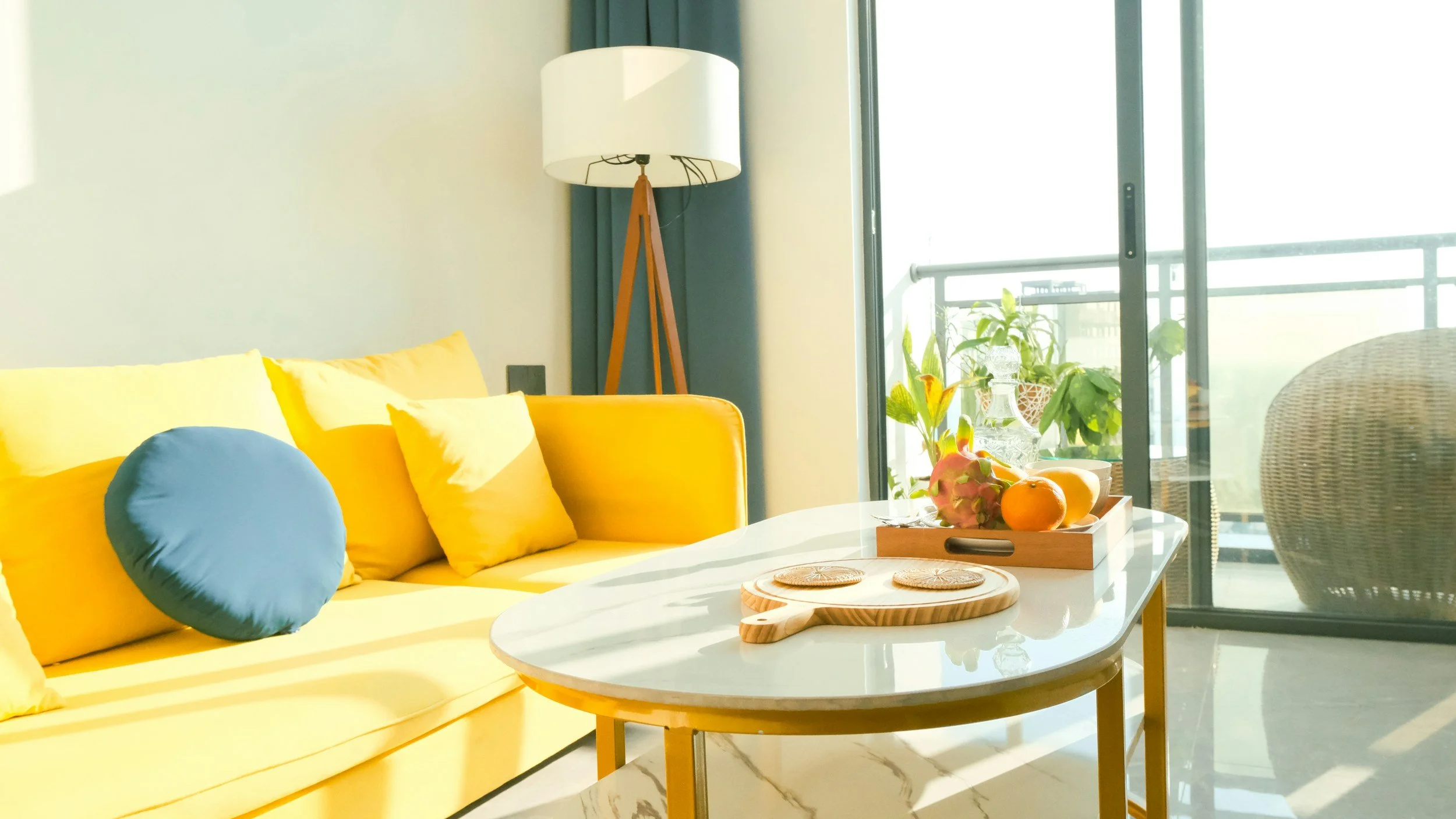
Earth tones such as beige, soft yellow, and warm neutrals represent stability and grounding. These colours often create a feeling of comfort and balance in living spaces.
White, soft greys, and metallic tones represent the metal element, associated with clarity and focus. These colours can be effective in workspaces or minimalist interiors.
Blues and deep blacks represent the water element, symbolising calm, reflection, and emotional depth.
Understanding these associations can help guide the choice of artwork and décor within the home.
Using Colour Through Artwork
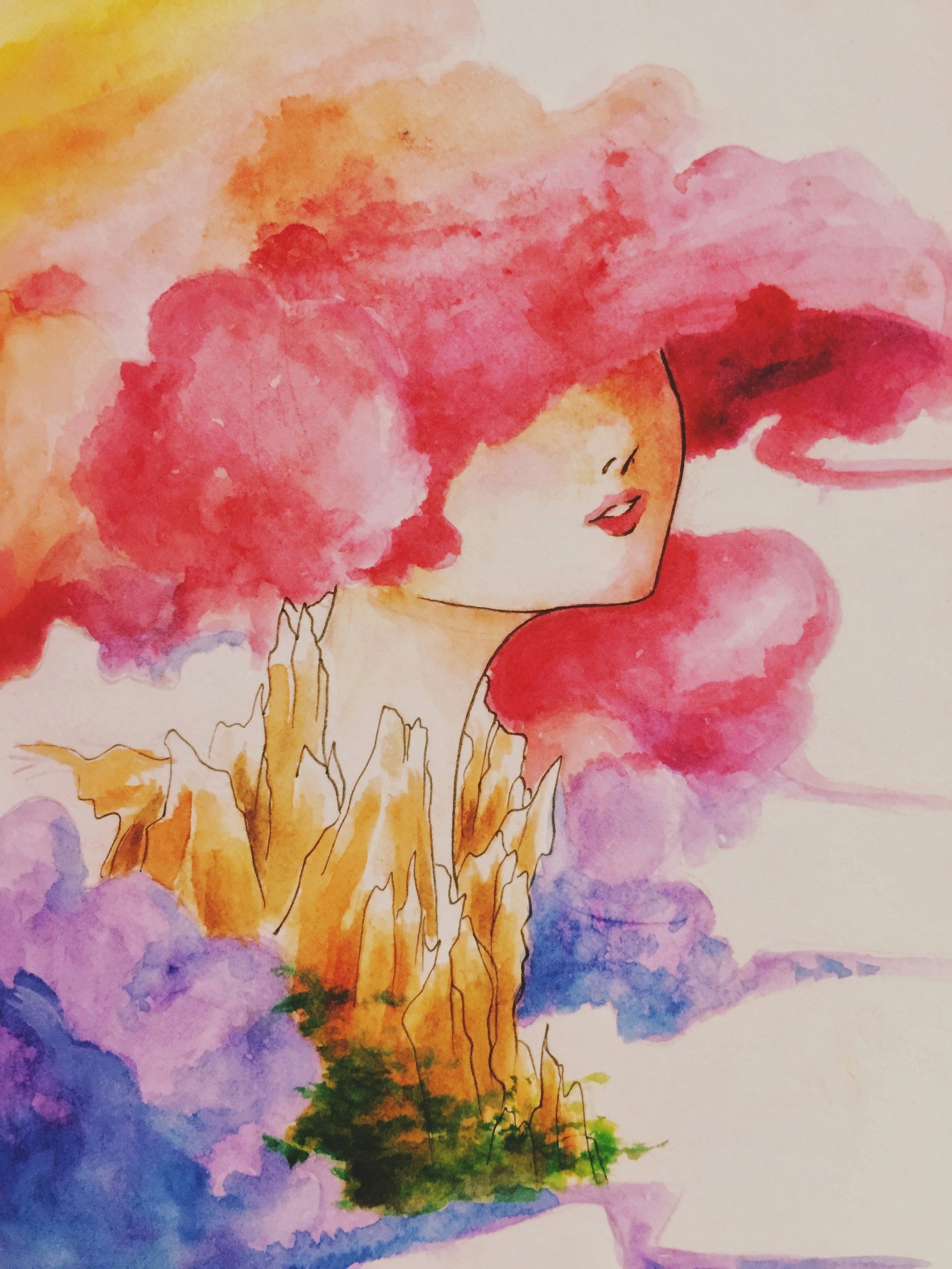
Artwork offers one of the easiest and most flexible ways to introduce colour into a space.
Unlike wall paint or large furniture pieces, artwork can be moved or changed as the mood of a room evolves. A painting with natural greens and blues might create a calming atmosphere in a bedroom or reading area, while brighter colours may energise a studio or creative workspace.
Because art carries emotional and visual meaning, it often becomes the centrepiece that defines a room’s colour story.
Choosing artwork that resonates personally is just as important as choosing colours that match the décor.
Creating Balance Through Colour
While colour can create strong emotional effects, balance remains the key to a harmonious space. Too many intense colours competing in one room may feel overwhelming, while too little variation can feel flat.
Thoughtful combinations of colour create visual rhythm. A room with neutral tones may benefit from a single artwork that introduces deeper or brighter shades. Similarly, a colourful room may feel more balanced with artwork that includes softer tones.
In feng shui, balance between the five elements is often encouraged rather than allowing one element to dominate.
Art can help achieve this balance by introducing subtle colour elements that support the overall energy of the space.
A Personal Relationship with Colour
Ultimately, colour is deeply personal. Cultural associations, memories, and individual taste all influence how we respond to different shades.
The colours we choose for art and interiors often reflect the atmosphere we wish to create in our homes — whether that is calm, warmth, creativity, or inspiration.
By understanding the emotional and energetic qualities of colour, it becomes easier to make thoughtful choices when selecting artwork and décor.
Colour then becomes not just a visual element, but a quiet contributor to the feeling of the home.